

Space 1999 Model kits: MPC Eagle with Cargo Pod packaging part 1
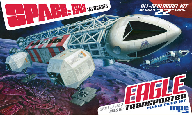
I may have mentioned a couple years ago when I wrote about our first 22” Space:1999 Eagle Transporter model kit packaging that one of the biggest challenges deciding whether to showcase the ship in ways that have never been seen before by presenting an angle or environment never pictured on-screen OR to play up to the familiarity of nostalgia and try and do a close representation of one of the many memorable scenes ingrained in the memories long-time fans hold onto. That was the first mountain I had to conquer when it came to designing the packaging for our new kit of the Eagle with Cargo Pod that will be winging its way to modelers’ workbenches this summer. My approach on the first 22″ Eagle package was to come with a new, unfamiliar angle of the ship. Though some fans would have liked to see a different approach, most have come to accept that kit’s packaging as part of the identity of the product if not the ship itself.
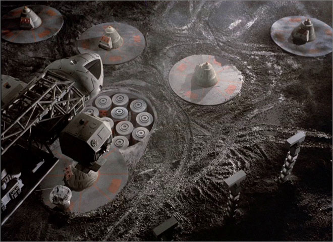
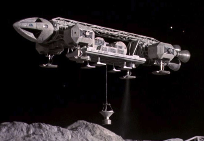
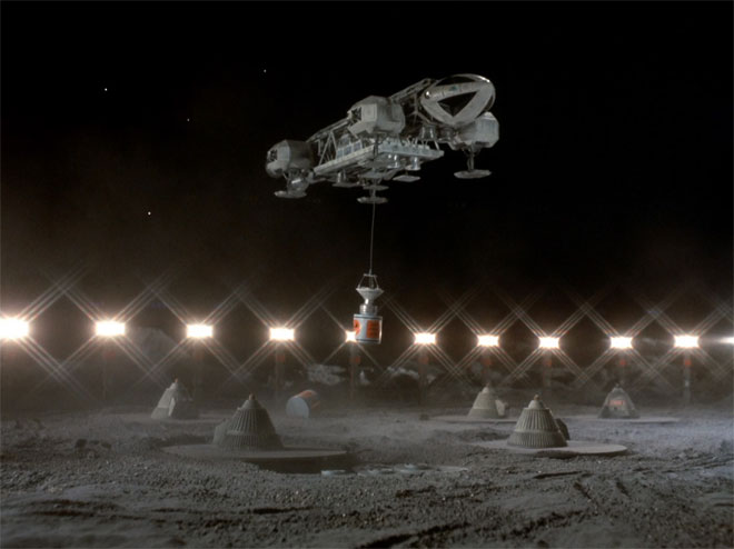
As I worked on the new kit’s development, one particular shot kind of inspired me, but a close representation of the scene wouldn’t have delivered what I needed as it only showed a portion of the Eagle, and what we could see of the cargo pod was crowded in darkness.
Besides picking an angle of the ship, I had two other things to keep in mind. 1) Focus on what is different in this kit, the cental pod. I had to make sure it can be seen clearly. 2) As a point of branding the two 22” kits, use the same basic layout, logo size and placement used on the first kit. That meant finding something to work within the slanted trapezoidal space present in the first kit. An idea started to form in my mind that would basically show what would happen in the few moments after that one particular frame. If done just right, it would check all the boxes.
I knew I was capable of painting the illustration, but I’d need a little help to pull it off if I wanted to show all of the props on the moon surface. So as usual, I contacted Jim Small to run my idea by him. Offering opinions comes easy to him and I knew if I was way off base, he would tell me. Now, I’ll let you in on a couple secrets. 1) I am extremely selfish when it comes to being able to paint box illustrations. Once I form an idea, I get anxious to start in right away to see if I can achieve my initial vision. And 2) In a similar fashion, Jim is selfish when it comes to building and photographing his models. He sees that illustration has its place, but he thinks a photo of the actual product serves the purpose better. That, and he wants to showcase the hard work he puts into his… work… So when I say, “Hey, Jim, I’ve been thinking about what I want to do for the cargo Eagle packaging.” (as soon as I finish that sentence), he comes back with “Oh yeah. You need to show a photo of the ship like this!”
To which I say “no no. I want to do something more like this.”
A discussion ensured to figure out exactly what we should do. It didn’t take long for Jim to realize that the idea I came up with was a reasonable approach. I asked him if he could do some really loose mockups to use as placeholders for the nuke cones and lamp stands. I wasn’t looking for anything authentically detailed or fancy, just something that could represent the props size-wise in relation to the Eagle buildup when he did the photography of the buildup that I would use for reference. I would be able to draw in everything including the details if he could just provide some indicators. He said that wouldn’t be a problem.
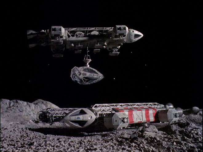
Now, I am totally onboard with showing plenty of photos of the model on the packaging. We do full color box bottoms for that exact reason. Other than knowing I needed to show some feature photos on the box bottom and sides, I hadn’t thought through the specifics for those photos. Over the course of our discussion, we looked at a few other screencaps of the cargo-equipped Eagle.
I said “You know, I DO want to show photos of the model in a familiar context like we did on the box bottom of the first kit. I know you like to scratch build stuff too. What if we did a close representation of the scene where the cargo Eagle carries away the damaged nose cone? We could composite everything so you really only need the one Eagle model if you want to scratch build the damaged nose cone from some parts I could send you.” Jim was intrigued with the opportunity and jumped in with both feet.
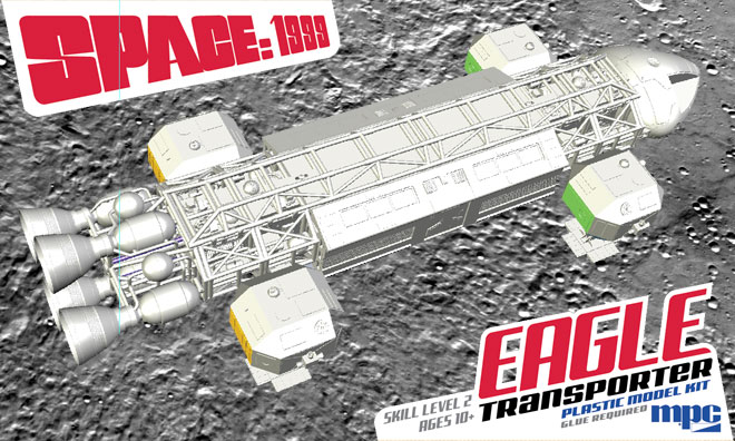
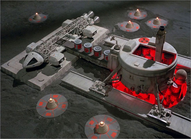
Getting back to the box illustration, I was starting to formulate an idea for the color scheme as well. Carrying over the design elements from the first package established the branding well enough, and I wanted to shift the color scheme from the first so that they wouldn’t be confused on the store shelf when viewed from a difference. For whatever reason, I always liked this shot of the Eagle (even though it is the 22″ model), and one of the reasons for that might be the mysterious red glow coming from within the storage elevator.
A white-ish ship over a gray moon doesn’t allow for much in the way of color. The show did a masterful job with lighting the ships to allow them to pop dramatically enough. But my purpose here was to imbue the image with enough color to make the kit jump off the shelf, and hopefully become as memorable as the first kit. I decided to explore a “RED ALERT” motif.
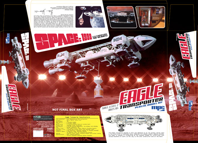
While we were still waiting on test shots to build for the photography, the need arose for box mockups to display at a couple early trade shows. Knowing that I couldn’t show with any accuracy what I intended for the final package look, I cobbled this together to at least portray the subject, setting and color scheme. It serve its purpose, but the future would hold greater things…
Next time we’ll have a special blog post from Jim Small to provide his side of the story and showcase the handmade miniatures he did that went way, WAY above and beyond what was originally asked for. After that, I’ll be back to show off the process of the box illustration before finally revealing a look at the new MPC Cargo Eagle model kit packaging!

I love the box art of the Eagle Transporter packaging. I still have the box. It’s too good to toss out.
The original 22″ Eagle box are is very representative of the show. I like what you are coming up with for the Cargo Pod Eagle’s box art.
I don’t envy your position. Impossible to please everyone.
That said, I think the Eagle’s perspective is not quite right. It looks like it is about to tip over.
I think if it was presented with less pitch and roll it would look better.
Just my humble opinion.