
Archive for the ‘Marvel’ Category
New York Comic con is just around the corner!
New York Comic con is just around the corner – October 10-13, 2013!
Round 2 will be there – stop by and see us at booth 443. You won’t want to miss our new model kits, die-cast cars, slot cars, Forever Fun, Captain Action, and even the Wicked Witch of the West will be in display.
http://www.newyorkcomiccon.com/
Polar Lights Models: Thor box art
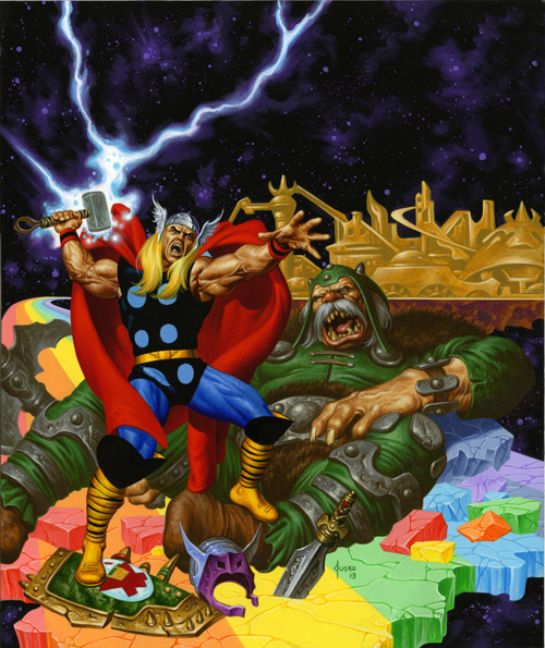
Although we just announced our upcoming Marvel Comics Thor model kit recently at Wonderfest, the kit has been in the works for some time. The Thor box art was just turned in this past week, so we figured we would show off a preview.
The first step in starting a kit like this is getting control drawings or turnaround drawings done of the model so that we can get the idea of the kit submitted to the licensor and also supply a clear vision of the kit to the sculptor. I did the drawings myself for the Wolverine kit. (I just couldn’t let the opportunity pass me by) I wasn’t quite as attached to Thor as a character. He has always been around as one of the key characters in the Marvel universe and an Avenger of course. My heart was always with the X-Men though. I knew what he was all about, knew his background and powers etc., but I wasn’t sure about the details and idiosyncrasies of the character. I needed to find someone that I knew I could bounce my overall idea off of and would be able to flesh it out form there. Joe Jusko came to mind. Though he is known as a painter, he had done a few pieces of line art for us for our Captain Action line so I figured I would run the job past him. As it turned out not only was he familiar with the character, he was a huge fan having read the Jack Kirby and John Buscema comics from the “Silver” and “Bronze” age of comics. Not only that, he also had a fondness for the old superhero models that we are all familiar with and was excited by the opportunity to turn one of his favorite characters into a kit.
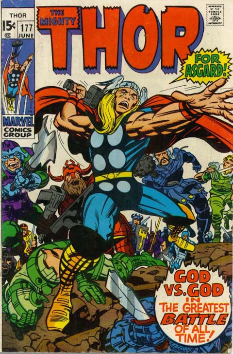
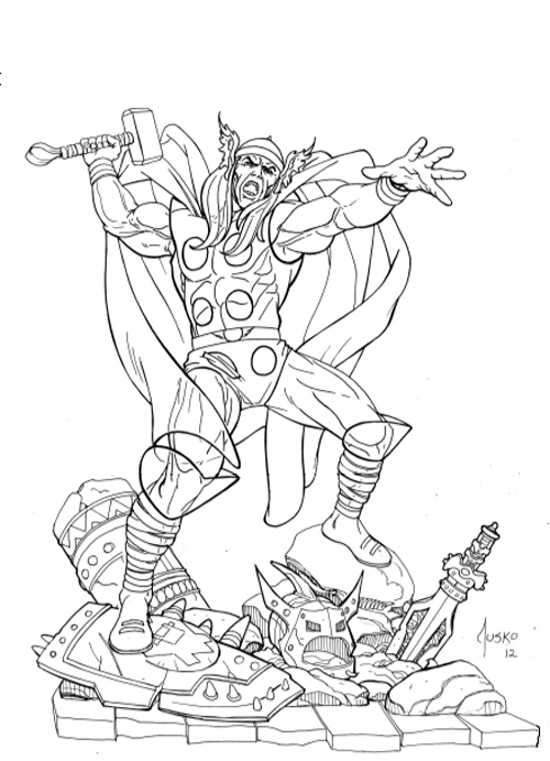
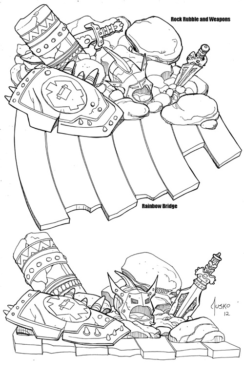
So, I explained my idea of trying to translate one of Kirby’s classic poses into a kit that would feature a modern, realistic but stylized sensibility. The one thing I was hung up on was what to do for the base. I like a figure to tell a story similar to the old Spider-man kit. Joe suggested a broken rainbow bridge along with some rubble and Thor-centric accouterments. As long as we could make sense of the goofy-footed Kirby-esque stance I was up for anything. He came back with an awesome drawing of everything we had discussed. I had to plan on editing it down a bit due to concerns for the cost, but for the most part, it was exactly what we needed.
Of course Joe’s next question was “any chance I could do the box art?” After some quick negotiations, we were able to come to terms to allow him to do just that. The exact pose he had drawn actually fit our established figure box layout quite well. So we decided to just keep working with that angle. The question then became, “Okay, what’s in the background?” Of course the remainder of the rainbow bridge and Asgaard of course, but I threw a bit of a monkey wrench into the works when I brought up the idea of the box turn reveal of a bad guy. I had used the same approach for the MPC Hulk & Spider-man kits and in a more overt way on Wolverine. Joe figured out a way to incorporate a fallen storm giant. Again, I trusted the Thor fans intuition and let him run with it.
I think the end result turned out great and I was glad to have such an established and respected artist like Joe. I also feel fortunate to have found that he was a true Thor fan and was able to contribute to a kit of one of his favorite characters.
All images subject to licensor approval.
Polar Lights Model kits: Wolverine model kit development
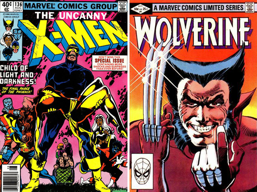
I’ve said many times before I’m a lifelong comic book collector. As a young kid, I was into the standard Superman, Batman and Spider-Man fare. I loved team books like the Justice League of America and the Avengers. If I already had the current issue of my favorite solo characters, I’d buy the book that had the most costumed heroes in it. As I grew older, I started actually READING the books instead of just looking at the pretty pictures. One day I stumbled across a comic I hadn’t eve noticed before and picked up X-men #136. My fellow readers can probably tell you that this was at the point where the X-men were growing in popularity among readers due to the classic work of writer Chris Claremont and artist John Byrne whose run on the title was building to a crescendo. No one outside of comics really knew about the X-men. They could point out Superman or the Hulk, but they wouldn’t be able to tell you who Colossus was. This issue hooked me and I loved every character in the book. A few years later Wolverine was got the spotlight treatment in his own mini-series and the story presented him as a deep, but savage and ruthless character. Over time, the X-men and especially Wolverine continued to grow in popularity until the rest of the world caught on. I still read Wolverine and X-men comics and they are all in incredibly different places now, but some of my fondest comic book memories are of the guy that claimed, “I’m the best there is at what I do… but what I do isn’t very nice…”
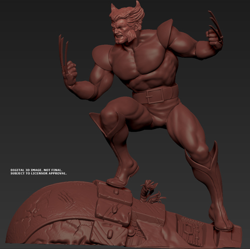
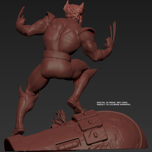
So it was with those fond memories in mind that I began our Polar Lights Wolverine model kit development. I wanted to keep him in his 70’s/80’s era look and landed on the yellow version of the suit mainly because that’s the one he started gaining popularity in. I also figured that anyone wanting to see a later version costume could omit the shoulder cuffs and with a little putty filling and sanding could make the brown suit version or with further mods create a more contemporary look. My goal was to make a great looking kit in his classic costume and keep it in reach to make any other version a modeler might want.
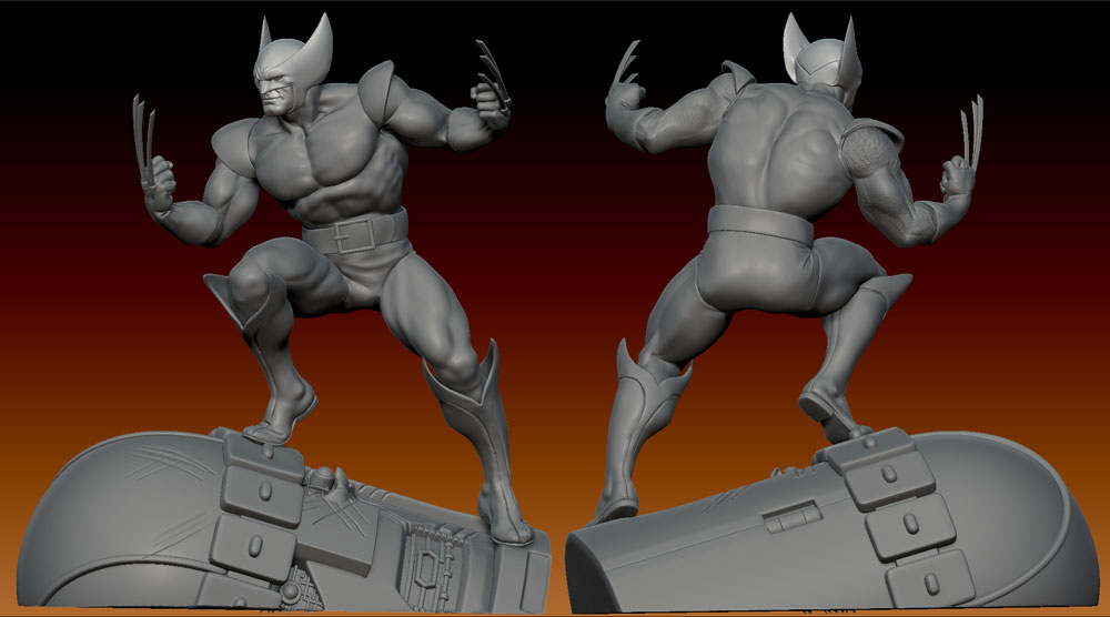
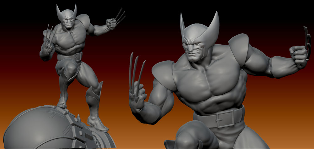
For the base, I originally considered making it out of a mass of dead Hellfire Club goons or ninjas. I felt ninjas would, by design, cause too many trapping problems on the tool. After thinking about how much more it would probably costs to sculpt several figures lying in a pile, I abandoned the Hellfire Club goons pretty quickly. Besides as villains, they weren’t terribly recognizable by anyone but longtime X-men fans. I landed on doing a Sentinel head. Even though they aren’t considered Wolverine’s arch foe, they were the villains in the classic “Days of Future Past” storyline in the Claremont/Byrne run in which Wolverine played a key roll. They would return to battle the X-men on several occasions. Besides, robots are cool and anyone who isn’t a die-hard would accept it as a normal occurrence for Wolverine to have taken down a big one.
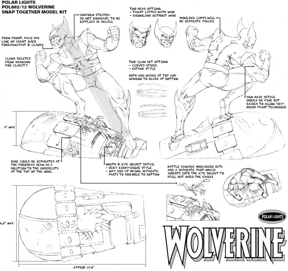
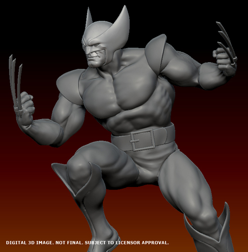
So here I show my original control drawing of the model. I wanted to capture a pose with plenty of movement for plenty of great views in the round. It was important for m to have the Sentinel look like he had lost a fight and supply plenty of room for additional detail in the eyes, mouth and other wounds. (I can’t wait to see someone add some fiber optic spark effects) We’ll be including the unmasked head, but the second set of claws has gone by the wayside.
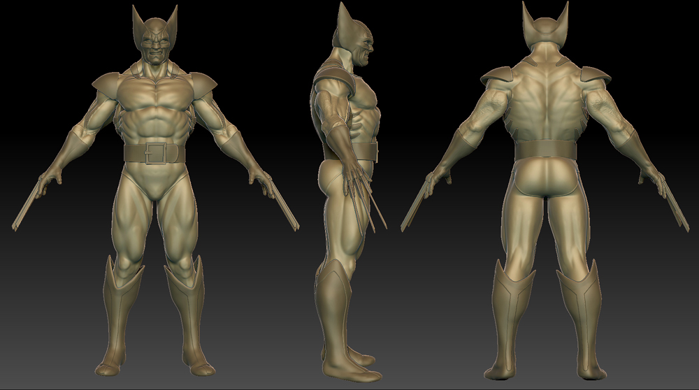
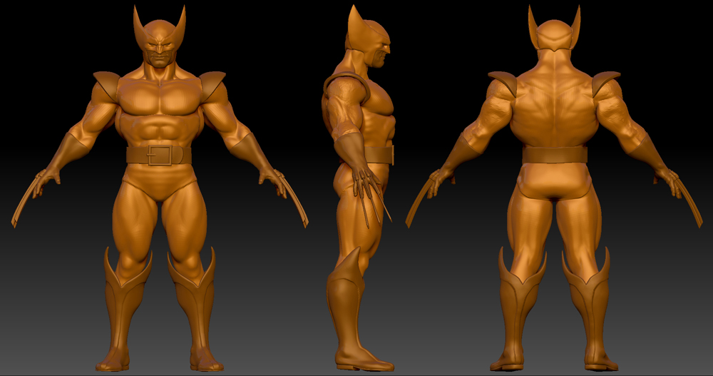
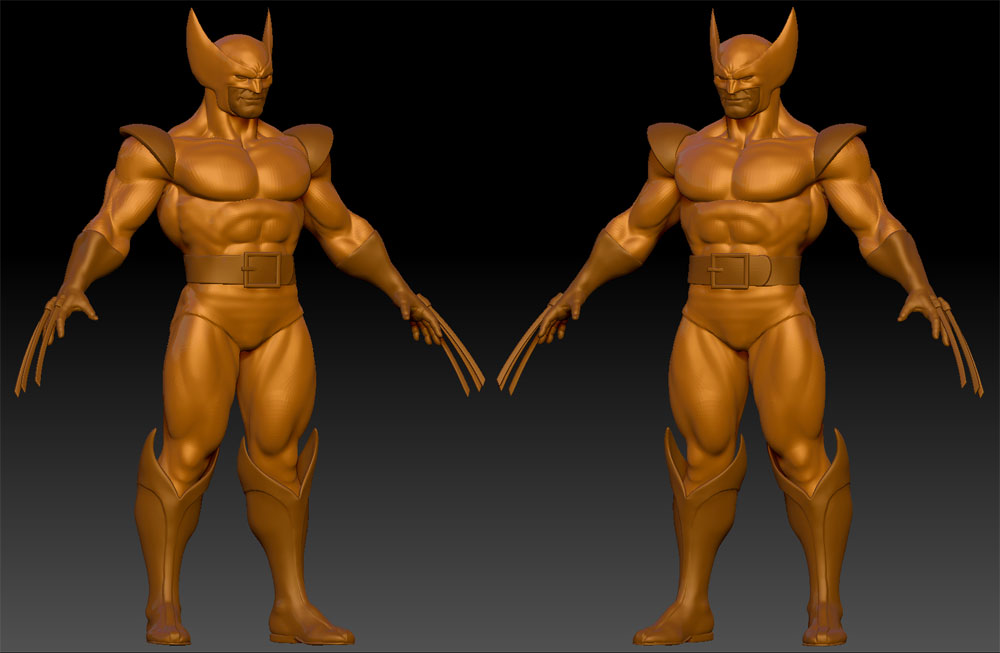
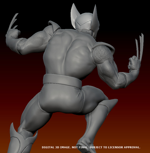
We hired Erick Sosa to sculpt the kit for us. If you are familiar with the many licensed resin statue products on the market, you may know his work. He has sculpted some great ones including iconic Punisher and Deadpool figures. Erick sculpts digitally in Zbrush and works on the look of the figure before posing it. This shows his initial sculpt which I deemed to be too contemporary for what I intended for this kit. The look of the character was too close to how we see him in comics today rather than his “bronze age” appearance. I wanted to stylize him slightly to make him look more like a character from a comic book rather than a real guy in a suit. We had to weigh the realism we can achieve today with the flavor of an Aurora-style figure. I think we ended up striking the perfect balance.
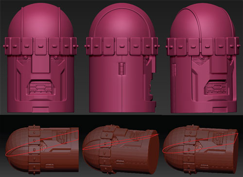
Here is a look at the Sentinel head before getting battle damaged. Figuring out the “waterline” was no easy task. As with all comics, the drawing allows any number of cheats, but translating it into real life gets tricky. I had designed it with an exact angle in mind that would result in a clean pull from the steel tooling. Conceptually, besides the rectangular shapes around his head and the structural damage protruding from the eye socket, it could be made as one piece. Whether or not this will be the case remains to be seen.
A look at the sculpt and images of the factory’s digital mockup next time…
Round 2 Models: Muscling Through Packaging
A lot of our development team’s time is spent on our product packaging. It is a key marketing and sales tool and in some cases, it makes the kit much more desirable. If you read our blog regularly, you are probably familiar enough with our products to know what to expect from us in this regard. I figured I would show you some of the steps we go through and what we encounter as we work.
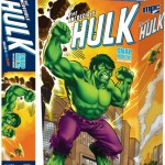
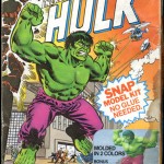
For this example, I’ll be using our upcoming release of the Incredible Hulk. In the case of this kit we started with what we had, a tattered copy of the kit released in 1978. The plan was to ditch the old packaging style completely and shift it more towards an Aurora style long box but keep a modern sensibility about it. Comparing the proportion of the art board to the long box style, I found we could center more in on Hulk and let the rest of the scene actually wrap around one side of the box to give the effect of “okay, here is the Hulk. He is mad” then as you turn to the side of the box, you get the reveal of “oh, this is what he is mad about”.
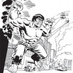
In order to start, the old box featured a giant violator that covered a major part of the background. An image of the buildup cut into Hulk’s knee. All of this is besides the fact that our box is nice and worn with plenty of cracks and stains in the image. The decision was made to break it down to just the line art and recolor it as I had done on the Spider-man and Captain America kits. This would give it the updated look I mentioned. The instruction sheet featured the same line art in pure black and white so I figured this would be a great head start. The problem was that the art on the instructions did not perfectly match the box lid. It wasn’t a complete redrawing but a few embellishments had been made to the artwork. A few lines were thicker here or there.
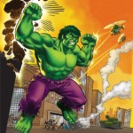
Once I broke it all down and mixed and matched the parts of the line art I wanted from the two illustrations, I set to filling in the gaps created by the violators. The only clue I had to the contents were an overturned car and smoke coming from it and who knows what else. There were also a few building tops peaking up from the behind the legal line on the instruction sheet. I found the look of the TV news style helicopters to be a little ridiculous and decided to embrace that a little bit. I decided to shift their color scheme to a more military look and drew in one of General Ross’ “Hulk-buster” tank on the ground to give him something to really get angry about. Filling in the rest of the cityscape background was logical to complete the rest of the scene.
So here it is, a sneak peak at the upcoming Incredible Hulk packaging. (All images are currently under licenor review and are subject to change) we will feature a build along article by Mark McGovern covering both the MPC Incredible Hulk and Spider-man kits on our website when we approach the release dates.
Marvel Comics Model Kits: The New Face of Freedom
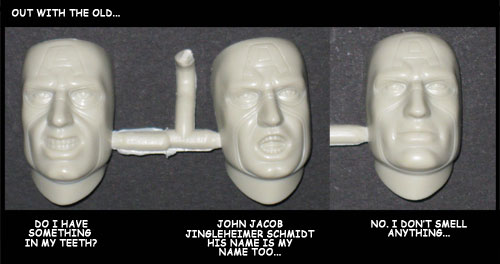
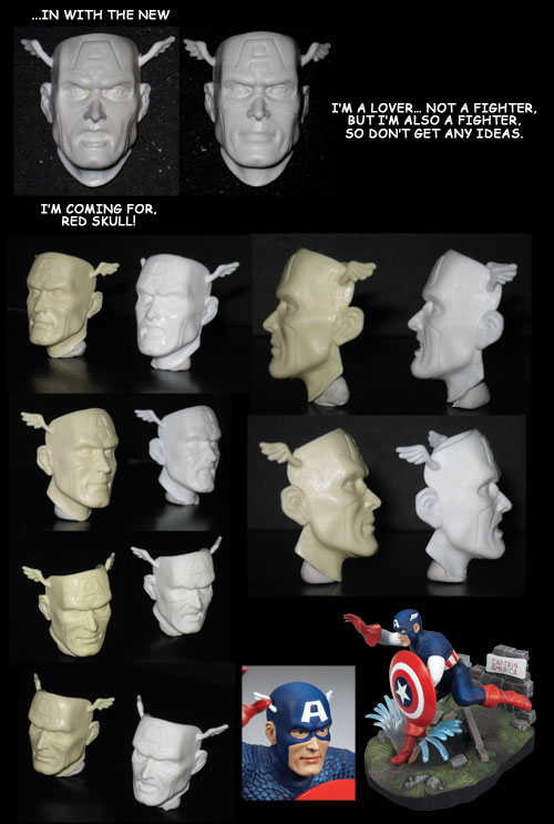
Let’s face it. Sometimes things just don’t turn out right. If you are lucky enough you can get a makeover. If you are really lucky you get to put on a brand new face… okay, I’ll can the puns and get on with it. Let me show you the new face parts we’ve come up with for our Captain America kit.
We were pretty excited to land the license to do Marvel Comics model kits. As I’ve said before, I’m a comic book collector and so is Bob and Andy, our web manager. Hard core comic collectors tend to think of themselves as either Marvel or DC fans. I can’t say I love one more than the other. My two favorite characters are Batman and Wolverine. Having to choose between the two depends on how the publishers handle them in a given month. So to say the least, I’ve been overjoyed to work on THE Batmobile and now I get a chance to work on some other iconic superheroes.
Spider-man will be out in the next couple months. We’ll follow him up with Captain America shortly after that. In reviewing the kits, it was pretty obvious what Cap needed. The original face sculpts though roughly reminiscent of the vintage kit was just… eew! I really can’t find words to describe it. One word that could not describe any of them was “heroic”. So that’s what we set out to change. It was a tricky job to capture just the right amount of realism and still keep a silver-age Marvel comic style. We found that going all the way Jack Kirby didn’t quite work out. It wouldn’t allow a “realistic” build. Plus, the rest of the body didn’t necessarily carry the chiseled look of a Kirby illustration. We settled it down to a John Buscema or Jim Steranko level and added just a touch more real life to temper it a bit. Hope you like it.

