
Model Kit: Tidbits shmidbits Vol.3
Bob posted a “special features” post awhile back about the Star Trek Enterprise E box art meant for the mass market. These would be larger stores to make sure the model kit offers a point of difference from the hobby shop version.
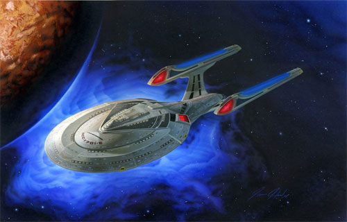
As he stated in that post, I was fortunate enough to do the hobby version box art. The Star Trek licensor has established a style guide to ensure the look of their brand that calls for us to use one of their supplied backgrounds. So I had a dilemma, do I just paint the ship or the ship on a background. I wanted a finished piece when I was done so I went ahead and did a full background too in hopes that someday the whole piece could be used somehow. The piece was a bear to do. 80% of it was a struggle just because I hadn’t picked up an airbrush in years. I didn’t start feeling good about it until about the last day or so as I worked on it. Looking back now, there are some things I wish I had done differently but overall it turned out pretty well. Here is a look at the entire piece with background and the lettering overlaid in photoshop.


Wonderful image. The E-e is my second favorite ship and a great subject. I’m sure many people feel the way you do about a finished project. Especially in the modelling world (I could have done that just a bit better.)
The best part is you can always do that next time!
Wonderful painting. For “not having touched an airbrush in years” it looks pretty fantastic to me. Neat to hear about someone still blowing paint for something like this, as opposed to shoving pixels around in Photoshop.
I’ll chime in here, too: Jamie’s art turned out great, and we are very fortunate to have someone of his talents working here. It’s rare that a nice illustration like this can be produced “in-house.” I am more of a traditionalist myself when it comes to model kit boxes, and tend to prefer illustrated packaging, as opposed to Photoshopped or CGI.
I wish we could have left Jamie’s original background in, as the blue nebula has some lovely subtleties and complements the ship beautifully, and would have worked with the overall blue color scheme of our Trek packaging. Fortunately, the illustrated background from the Trek style guide is pretty decent and has worked nicely for most of our hobby packaging. For the final E-e packaging, Jamie recomposited the image himself in Photoshop, incorporating the background and adding some subtle motion and lighting effects to the ship. He also added a couple of the sparkles/highlights that seem to have become part of our graphic vocabulary for our Trek packaging. Compositionally, the ship crossing in diagonally and bleeding off the right edge gives it a strong, simple dynamic and implies an additional sense of motion and urgency.
That is indeed beautiful. Reminds me of the painting Capt Picard hangs in his Ready Room. On a side note, I wanted to thank you guys for shrinking the size of the box on the E. Much as I love the Ertl size for room for art and such, your boxes are much nicer to have around.
WOW!
(just hitting this blog for the first time in a few weeks)
Jamie, all this time I had no idea that you were the artist who created that box art! It’s a shame your signature wasn’t on the box! It should be!
Beautiful job!!!!! (any chance of making posters available to us?)
Jim- Thanks a lot. If I could make a living at it, I’d be a full time illustrator. I’m glad I had the opportunity to work on the piece. It looks like I’ll be doing more real soon.
We have discussed posters. Maybe some day.